Embark on a journey into the world of infographic design, where creativity meets information in a visually appealing way. Dive into the realm of colors, shapes, and data visualization as we explore the art of creating impactful infographics.
Infographic design has become an essential tool for modern communication, combining aesthetics with information to captivate audiences across various platforms.
What is Infographic Design?
Infographic design is the visual representation of information, data, or knowledge in a clear and concise manner. It combines graphics, charts, and text to make complex ideas more understandable and engaging for the audience.Visual communication plays a crucial role in infographic design as it helps to grab the viewer's attention and convey information quickly and effectively.
By using colors, images, and typography, infographic designers can simplify complex concepts and make them more memorable.
Key Elements of an Effective Infographic Design
- Clear Purpose: Every infographic should have a clear objective or message that it aims to communicate to the audience.
- Visual Hierarchy: Organize the information in a way that guides the viewer's eye through the content, from the most important to the least important details.
- Relevant Data: Use accurate and relevant data to support your message and make it more persuasive.
- Consistent Style: Maintain a consistent color scheme, typography, and design elements throughout the infographic for a cohesive look.
- Engaging Visuals: Incorporate eye-catching graphics, icons, and illustrations that enhance the overall visual appeal of the infographic.
Types of Infographics
Infographics come in various types, each serving a specific purpose to effectively communicate information visually. Let's explore some common types and their design considerations.
Informational Infographics
Informational infographics are designed to educate and inform the audience about a particular topic. They typically present complex information in a simple and clear format, making it easier for viewers to grasp the key points. These infographics are great for explaining processes, concepts, or providing an overview of a subject.
- Example: An infographic explaining the water cycle in a visual step-by-step format.
- Design Considerations: Focus on clarity, use of icons and visuals, and a logical flow of information.
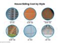
Statistical Infographics
Statistical infographics are data-driven and are used to present numerical information in a visually appealing way. These infographics often include charts, graphs, and diagrams to help viewers understand complex data sets at a glance. They are great for showcasing survey results, trends, or comparisons.
- Example: A bar chart infographic displaying sales data for different products over a period of time.
- Design Considerations: Choose the right type of chart/graph, use consistent colors, and ensure data accuracy.
Timeline Infographics
Timeline infographics are ideal for showcasing a sequence of events in chronological order. They are commonly used to illustrate historical timelines, project schedules, or company milestones. By visually representing the progression of events, timelines make it easy for viewers to follow a narrative.
- Example: A timeline infographic detailing the evolution of technology over the decades.
- Design Considerations: Clearly label each milestone, use a linear layout, and include visuals to enhance engagement.
Process Infographics
Process infographics visually depict a series of steps or actions to explain how something works or how to accomplish a task. These infographics are great for instructional purposes, guiding viewers through a process in a sequential manner. They are commonly used for tutorials, recipes, or workflow diagrams.
- Example: A process infographic demonstrating the steps to create a DIY project.
- Design Considerations: Use a clear hierarchy of information, incorporate icons for each step, and maintain a consistent visual style.
Design Principles for Infographics
When creating visually appealing infographics, it is crucial to adhere to essential design principles that help convey information effectively. Utilizing color, typography, imagery, hierarchy, balance, and alignment thoughtfully can significantly impact the overall design and readability of an infographic.
Color in Infographic Design
Color plays a vital role in infographic design as it can evoke emotions, create hierarchy, and enhance visual appeal. When using color in infographics, it is essential to choose a cohesive color palette that aligns with the brand or theme.
Utilize contrasting colors to highlight important information, use a limited color scheme to avoid visual clutter, and ensure color accessibility for all viewers, including those with color vision deficiencies.
Typography in Infographic Design
Typography is another crucial element in infographic design that can affect readability and visual hierarchy. Selecting appropriate fonts, sizes, and styles can help guide the viewer's eye through the content. Use a combination of headline, subheadings, and body text to create a clear information hierarchy
Ensure text is legible and avoid using too many different fonts or font sizes that may distract from the main message.
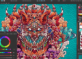
Imagery in Infographic Design
Imagery is a powerful tool in infographics that can help communicate complex ideas quickly and effectively. Choose relevant and high-quality images that support the content and enhance understanding. Incorporate icons, illustrations, charts, graphs, and other visuals to break up text and make the information more engaging.
Ensure that all imagery is cohesive and aligns with the overall design aesthetic.
Hierarchy, Balance, and Alignment in Infographic Layout
Establishing a clear hierarchy, balance, and alignment in the infographic layout is essential for guiding the viewer's attention and creating a visually appealing composition. Use size, color, typography, and spacing to create a visual hierarchy that prioritizes key information. Maintain balance by distributing elements evenly throughout the design and avoiding overcrowding or empty spaces.
Align text, images, and graphics consistently to create a cohesive and organized layout.
Tools and Software for Infographic Design
When it comes to creating visually appealing and engaging infographics, having the right tools and software is essential. There are several popular options available that cater to different skill levels and design needs. Let's explore some of the top tools and software used for infographic design.
Popular Infographic Design Tools
- Canva: Canva is a user-friendly design tool that offers a wide range of templates, graphics, and fonts to create stunning infographics. It is perfect for beginners and professionals alike.
- Piktochart: Piktochart is another popular choice for creating infographics with its drag-and-drop interface and customizable templates. It is known for its ease of use and versatility.
- Adobe Illustrator: Adobe Illustrator is a more advanced design software that provides extensive features for creating intricate and detailed infographics. It is widely used by professional designers.
Comparing Features and Capabilities
- Canva: Offers a simple interface, extensive library of design elements, and collaboration features. Great for quick and easy infographic creation.
- Piktochart: Provides customizable templates, charts, and icons, along with the ability to import data. Ideal for creating informative and visually appealing infographics.
- Adobe Illustrator: Offers advanced design capabilities, precise customization options, and high-quality output. Best suited for complex and detailed infographic designs.
Tips for Choosing the Right Tool
- Consider your design experience: Beginners may find Canva or Piktochart more user-friendly, while professionals may prefer the advanced features of Adobe Illustrator.
- Think about your design needs: If you need to create quick and simple infographics, Canva or Piktochart may be more suitable. For intricate designs or customization, Adobe Illustrator is a better choice.
- Explore free trials: Many design tools offer free trials, allowing you to test out the features and see which tool aligns best with your design style and requirements.
Closing Summary

In conclusion, mastering the art of infographic design opens up endless possibilities for conveying messages effectively. From choosing the right colors to structuring information, each detail plays a crucial role in creating visually stunning infographics that leave a lasting impression.
Top FAQs
What is Infographic Design?
Infographic design is the visual representation of data and information in a clear, concise, and engaging manner to communicate complex ideas effectively.
How important is visual communication in infographic design?
Visual communication is crucial in infographic design as it helps attract and retain the audience's attention, making information easier to understand and remember.
What are the key elements of an effective infographic design?
The key elements include visual hierarchy, data visualization, use of color and typography, storytelling, and simplicity in design to convey information efficiently.
Which are the popular tools and software used for creating infographics?
Popular tools include Canva, Piktochart, and Adobe Illustrator, each offering unique features and capabilities to enhance infographic design.
How do you effectively use color, typography, and imagery in infographic design?
Color, typography, and imagery should be used strategically to create contrast, emphasize key information, and maintain visual consistency throughout the infographic.


